|
During our recent digs in the AirportHistory.org archives we unearthed a very interesting 1980 British Airways brochure advocating for the construction of a fifth terminal at Heathrow, which could be ready as early as 1989.
Interestingly, permission to build Terminal 4 had just been given the year prior and construction hadn't even started. So, how come British Airways was already lobbying for the next terminal, complete with artist's impressions? Was BA simply extremely forward-looking, considering the long lead time in the UK to build large airport projects? Find out the answer below! 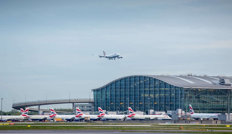
An exterior view of Terminal 5 at Heathrow. Credit: Rogers Stirk Harbour & Partners
THE NEED FOR CAPACITY
By the early 1970s, serious doubts had arisen about the necessity for a new London airport in the Thames Estuary, 45 miles (70 kilometers) east of Central London. As a result, the focus shifted back to providing additional capacity at existing airports. At the time, the maximum capacity of Heathrow's three terminals was thought to be 30 million annual passengers. Traffic forecasts indicated that there would be a capacity shortfall between 1982 and 1986. 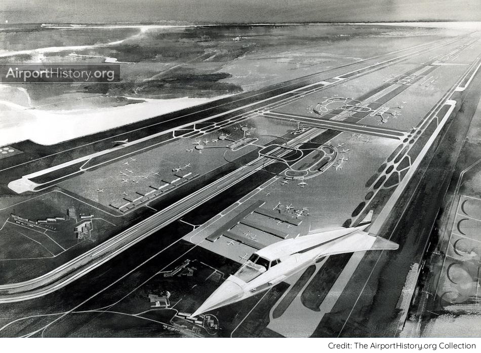
An artist's rendition of the canceled London Maplin Airport, which was to be built on partially reclaimed land in the Thames Estuary east of London. The plans were officially cancelled in 1974.
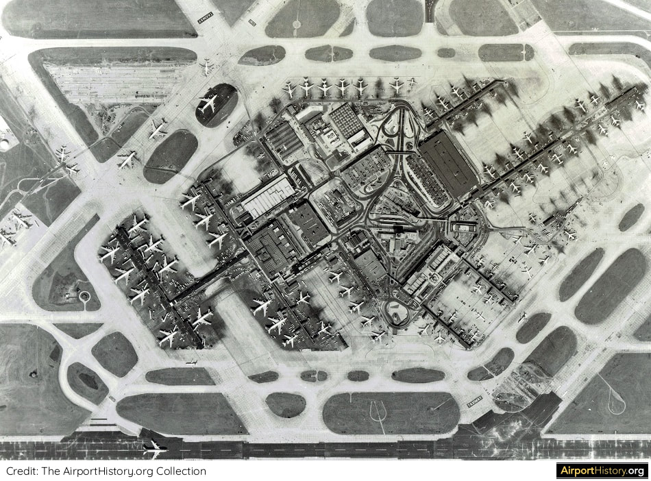
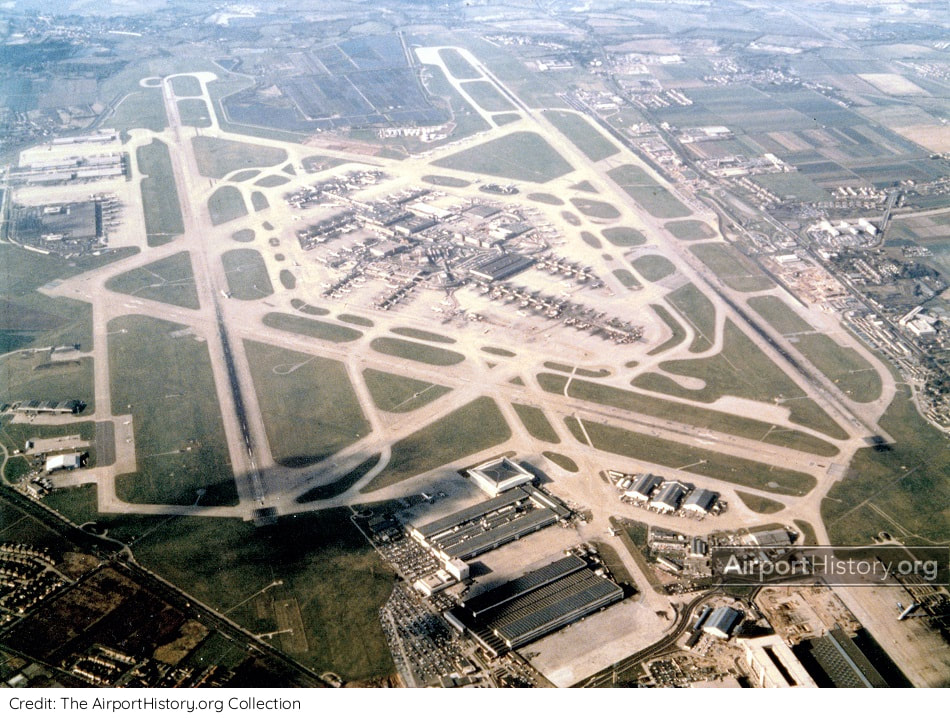
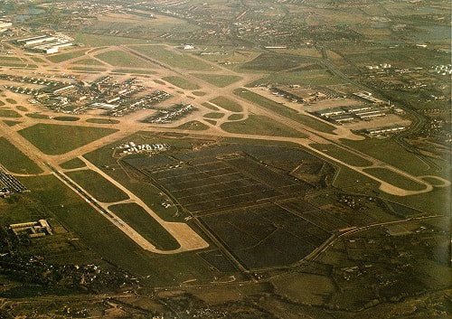
A 1970s vertical view of Heathrow's central terminal area.
TWO OPTIONS FOR TERMINAL 4
The immediate priority was to build a new Terminal 4 at Heathrow, where pressure was greatest. Planning work started in 1973. One option was to develop the site of the Perry Oaks sludge works on the western side of the airport, where a terminal with a capacity of 15 million passengers could be provided. The site was located between the main runways, decreasing aircraft taxi times. It could be easily connected to the M25 Orbital Motorway, which was being built at the time. 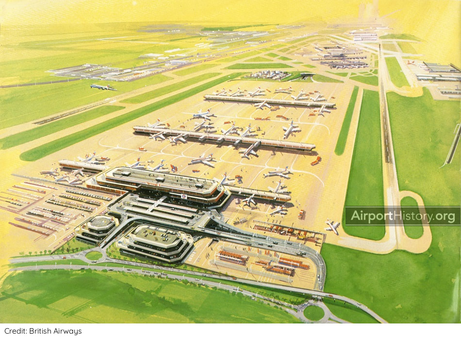
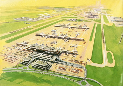
A 1970s artist's impression of what could have been Terminal 4 at the Perry Oaks site. It would be built decades later as Terminal 5.
Want more stunning airport photos & stories?
Sign up to our newsletter below to know when new content goes online
The other option was to build a much smaller terminal with a capacity of 8 million annual passengers on a 70-hectare site southeast of the airport.
For obvious reasons, the Perry Oaks alternative was heavily backed by British Airways, which has its home base at Heathrow Airport. However, the Perry Oaks option was ruled out because of the lead time involved in clearing the site, which was believed to be several years. Thus planners chose the southeast site, it being the only site where a new terminal could be built in time before existing capacity limits were reached in the mid-1980s. 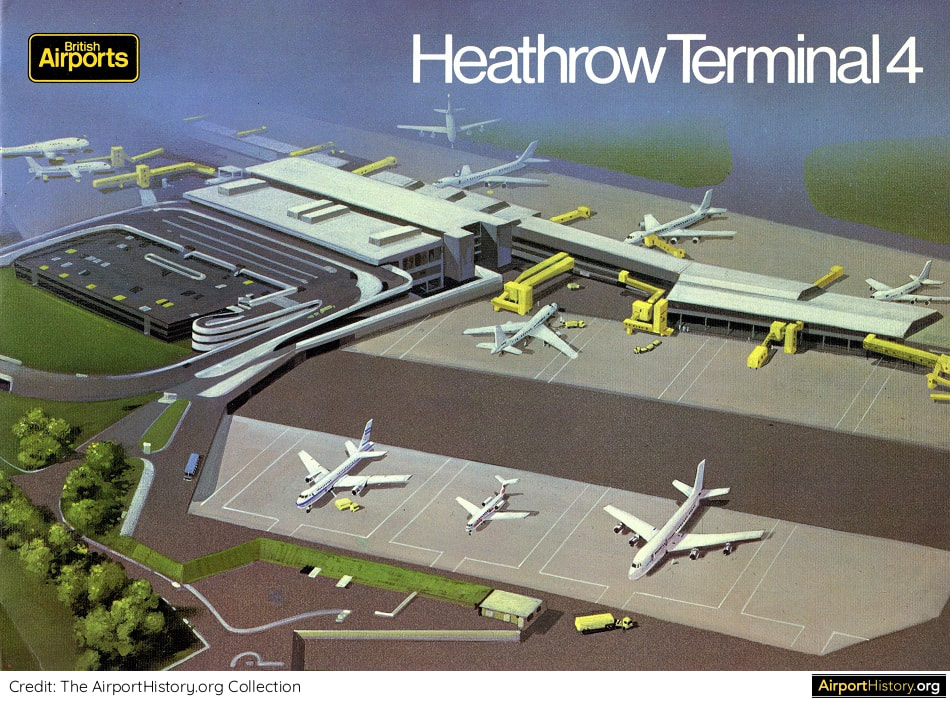
An artist's rendition of the then-proposed Terminal 4, located on the southeastern perimeter of the airport.
A 1970s aerial view of Heathrow looking west. Terminal 4 would be developed southeast of the airport, in the lower left of this image. The Perry Oaks site is the empty area beyond the Central Terminal Area between the main runways (top center of image).
In December 1979, the UK government approved the construction of Terminal 4. The terminal, which was to be used for British Airways long-haul flights, would raise the airport's capacity to 38 million annual passengers, which was considered the absolute maximum the airport could handle.
All further future growth was to be channeled through an expanded Stansted Airport, located 42 miles (67 kilometers) northeast of Central London. Obviously, the prospect of having to split its traffic over multiple airports was not an attractive one to British Airways. Thus, soon after the decision to built Terminal 4 was taken, the airline published the aforementioned brochure, arguing for the development of Heathrow beyond Terminal 4 with a fifth terminal. It could readily present the Perry Oaks plans developed previously. 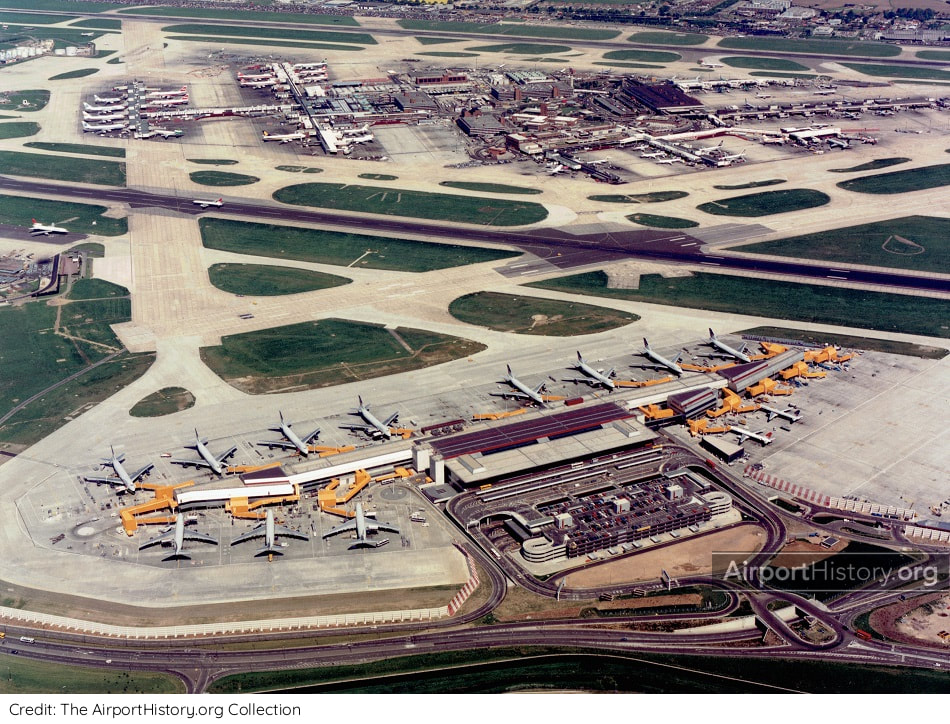
A 1986 aerial of the newly-opened Terminal 4, which housed British Airways' long- haul operations.
WHAT HAPPENED AFTER
Built at a cost of GBP 200 million, Terminal 4 was opened by the Prince and Princess of Wales on April 1, 1986. Planning studies for Terminal 5 got underway soon after in February 1988. BAA formally announced its proposal for construction of Terminal 5 in May 1992, submitting a formal planning application on February 17, 1993. T5 was inaugurated on March 14, 2008 and is now the home base of British Airways. In 2019, Heathrow handled almost 81 million passengers, more than twice the amount planners thought Heathrow was capable of back in the 1970s! 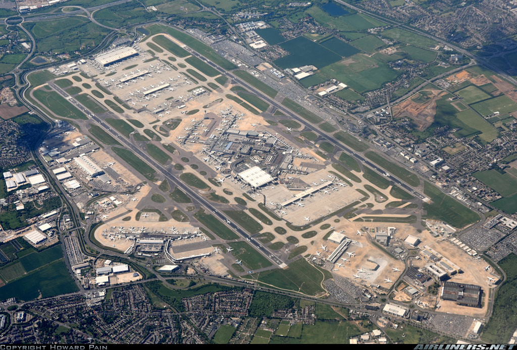
A 2015 aerial of Heathrow Airport, with Terminal 4 located in the bottom left and Terminal 5 in the upper left of the image.
If Terminal 4 had been built at the Perry Oaks site, how would Heathrow have developed later on? Let us know your thoughts in the comments below!
Did you know that plans to build additional runways at Heathrow date back all the way to 1946? You can read that story here. A special thanks to Heathrow expert Kevan James. Check out his website here.
More airport articles: Click here
Add the Terminal 5 brochure to your airport collection!
Click the images below to purchase a high-quality digitized copy of this 26-page public information brochure, a must-have for airport history fans!
Want more stunning airport photos & stories?
Sign up to our newsletter below to know when new content goes online
1 Comment
Para la versión en español, haga clic aquí
Our fans in South America frequently send us messages requesting we don't neglect the airports on their beautiful and amazing continent. They are right of course, and today we will start correcting the record!
Deep in the AirportHistory.org vault, we recently found the 1969 Master Plan for Maiquetía "Simón Bolívar" International Airport, the main international gateway for Venezuela. In the mid-20th century, Venezuela was a booming oil country. With air travel rapidly growing and money being plentiful, the government planned for a huge expansion project, which was only partially implemented. Curious about what the planners originally had in mind for the future of Maiquetía? Without further ado, let's take a look! 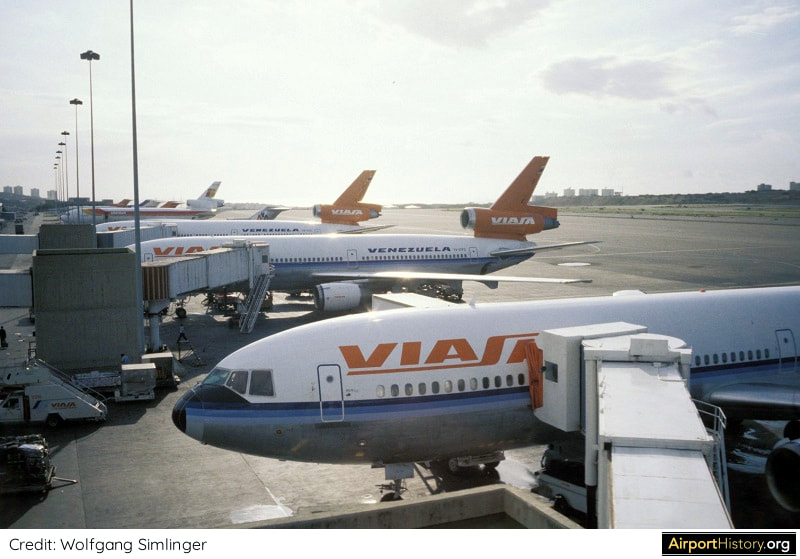
An airside image of Maiquetía Airport's international terminal back in the 1980s.
A SHORT HISTORY
Known originally as La Guaira Airport, the airport was constructed in 1930 by Pan American Airways. By 1949, it had a 5,000-foot (1,524-meter) runway, which was later extended to 9,842 feet (3,000 meters). The original terminal building, toward the eastern end of the airport, was opened in 1948. 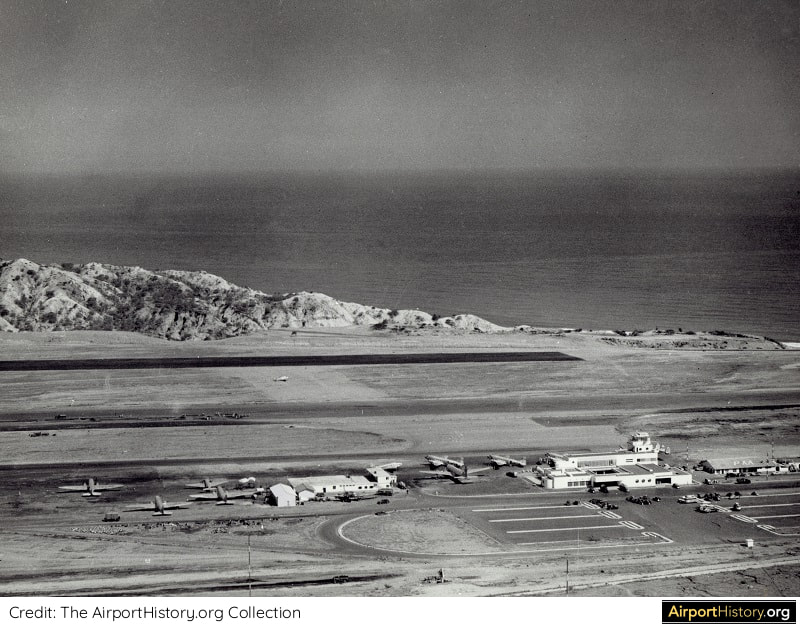
This 1948 aerial view of what was then called La Guiara Airport showcases the airport's scenic location on the seaside.
MASTER PLAN
By 1970, Maiquetía was handling 1.47 million passengers, making it the third busiest airport in South America, after Bogota El Dorado and São Paulo Congonas airports. Since its founding in 1960, VIASA, Venezuela's national airline, had quickly developed into of South America's premier airlines, connecting cities in South America, North America, and Europe. The airline needed a home airport that could accomodate its growth ambitions. In 1968, the government engaged the services of the renowned firm Tibbetts, Abbott, McCarthy, and Stratton (TAMS) to prepare plans for Maiquetía's future development. 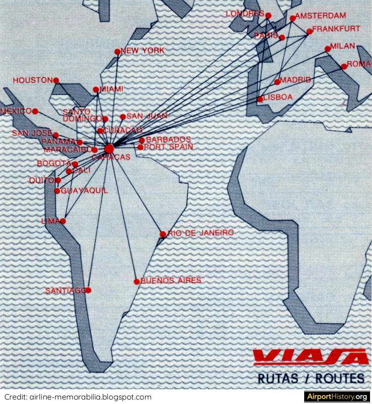
In the 1970s, VIASA became a major international airline, connecting passengers between cities in South America with cities in North America and Europe, through its Caracas hub. This map shows the airline's route network in 1979.
Did you know?
One of the experts in charge of the Maiquetía Master Plan Project was Walther Prokosch, the architect who led the design of the legendary Pan Am terminal at JFK Airport and the Master Plan for DFW Airport.
NEW RUNWAYS
Traffic studies projected that Maiquetía would handle 30 million passengers by the year 2000, 20 times more than in 1970, thus requiring a radical expansion of the airport. Planners envisaged a large-scale expansion of the airport to the west with two new runways and a new passenger terminal complex. First, a new 11,483-foot (3,500-meter) runway 09/27 would be built between the original runway 08/26 and the sea. Its consctruction would involve moving 650 million cubic feet of earth. The runway was commissioned in 1975. Later on, a second runway would be built 705 feet (215 meters) to the north and west of runway 09/27. It would have a full length taxiway and its construction would involve the removal of a series of hills beside the shore. The runway was to be completed in the early 1980s, after which the original runway 08/26 would likely be closed. 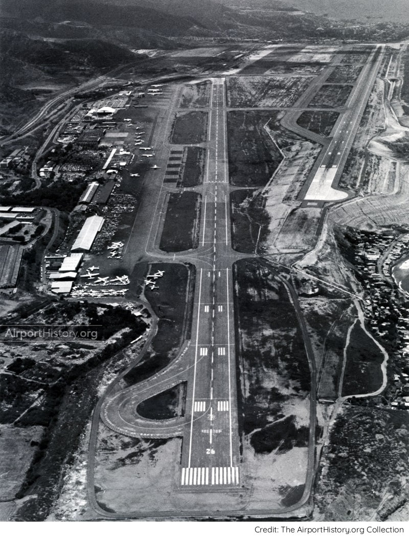
A late 1970s aerial view looking toward runway 08/26. The newly built runway 09/27 is visible in the upper right with the new terminal area to the left of it. The planned second parallel runway 09/27 was never built.
TERMINALS
In the ultimate layout, planners envisaged a series of passenger terminal buildings built along a spine road. To the north would be four terminal modules handling international flights. On the south side--the mountain side--would be an elongated terminal building handling domestic flights. A total of 48 gates served by passenger boarding bridges would be provided: 24 international gates and 24 domestic gates. The international and domestic sides would be connected by buildings in the median of the spine road, which contained concessions. There would be parking space for 2,800 cars. The complex was too small to justify an automated people mover shuttle but space was left in the design to construct one eventually if needed. 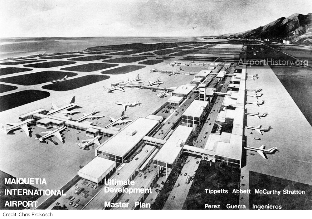
An artist's rendition of the passenger terminal complex as envisaged in the year 2000. Note the parallel second runway 09/27 to the left and the original runway 08/26 which has been removed.
Want more stunning airport photos & stories?
Sign up to our newsletter below to know when new content goes online.
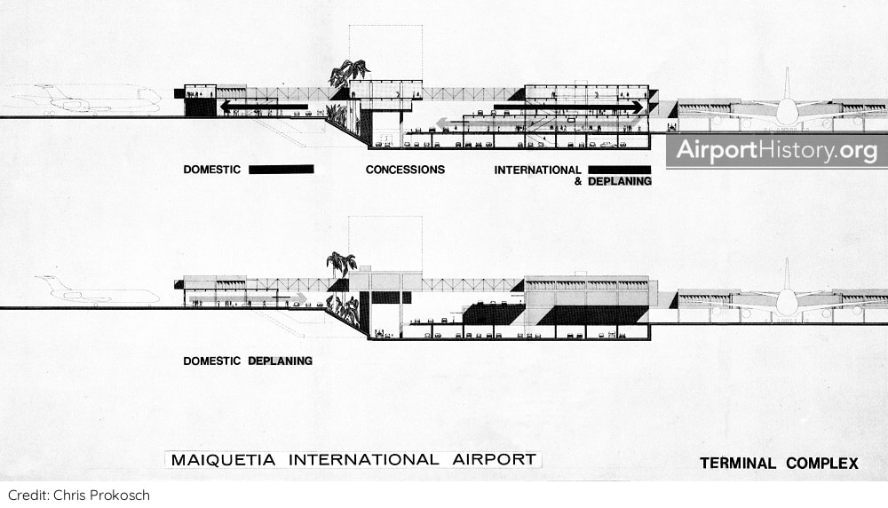
A cross-section of the proposed terminal complex. Interestingly, because of the terrain, the domestic platform would be at a higher elevation than the international side.
PHASED DEVELOPMENT
Initially, all development would take place on the north side with separate passenger terminals for international and domestic traffic, These opened in 1978 and 1983 respectively. The terminals had boarding concourses running along the length of the terminal. Later on, perpendicular pier could be added, increasing the number of contact stands. At this point, it is unclear if the idea of a south domestic terminal in the long run was retained or if it was dropped from the Master Plan early on. Leave us a comment below if you know the answer! 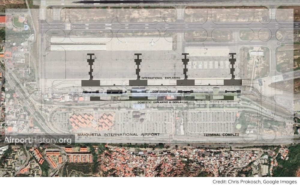
The layout of the original Master Plan transposed over the current layout.

A late 1970s exterior view of the newly-built international terminal, which was designed in the style of brutalism. The terminal had seven boarding bridges and a presidential gate. Plane-Mates were used for remote stands.
SLOWER GROWTH
Over the decades, traffic growth was much slower than anticipated. The traffic of 30 million passengers, which had been projected in the late 1960s, was never reached. The record stands at 12.18 million passengers in 2013, after which the economy went into free fall. As a result, the Master Plan was only partially implemented. The parallel runway 09/27 was never built. Also, no additional passenger terminals were added. Instead, in the early 2000s, the existing international terminal was enlarged and re-modelled. The domestic terminal has not been altered, only having been outfitted with new glass-cladded boarding bridges. 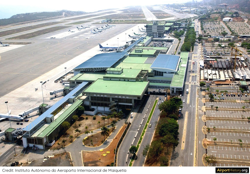
An aerial of the international terminal taken after the early 2000s expansion and refurbishment. The airport administration building and domestic terminal are visibile in the background. Also note the construction on the terminal forecourt. This was to be an airport hotel but was never finished.
The 1968 Maiquetía Master Plan stands testament to a time when the sky was literally the limit for Venezuela. Let's hope these times will return one day!
What are your thoughts on the original plans for Maiquetía? Let us know in the comments below!
More airport articles: click here
Want more stunning airport photos & stories?
Sign up to our newsletter below to know when new content goes online.
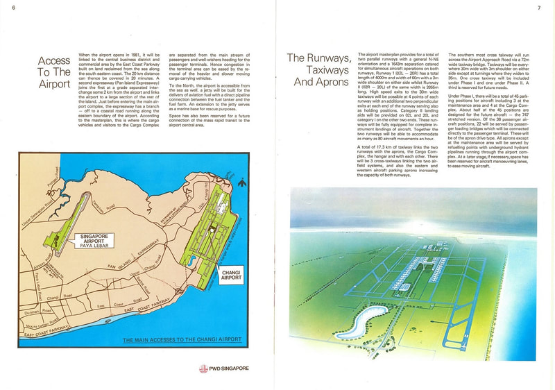
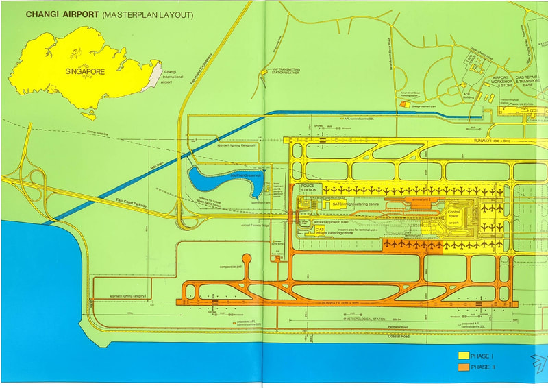
On July 1st, 1981, 40 years ago, Singapore Changi Airport opened for traffic. The airport went on to become a consistent favorite with travelers, winning the "World's Best Airport" title for eight years in a row (2013-2020). In a larger context, Changi Airport has played a pivotal role in cementing Singapore's role as a regional hub of trade and commerce. In this short article, we will show you a few rare images from the airport's planning phase and very early years of operation. You might learn a thing or two about your favorite airport that you didn't know before! 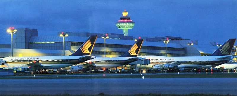 THE NEED FOR A NEW AIRPORT As the Singaporean economy rapidly grew in the 1960s, traffic at Paya Lebar Airport, the nation-state's only civil airport, boomed as well. Even though Paya Lebar was opened as recently as 1955, by the early 1970s, it became clear that the airport could not accommodate Singapore's long-term air traffic needs; due to urban encroachment, the airport, which only had one runway, could not expand and noise issues were becoming an increasing concern. As a result, in 1975, the Singaporean government took the decision to build a brand-new airport that could serve the country's needs well into the 21st century. The airport would be built at the far eastern tip of the island, which was already the site of Changi Airbase. After completion of the new airport, Paya Lebar would be converted to a military air base. 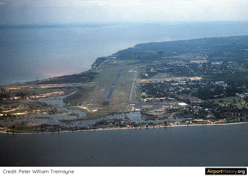 A very rare 1958 color image of Changi Airbase--then called RAF Changi--whose origins date back to World War II. The new airport would be built east of the base (to the left of the image) and bear its name. A total of 200 hectares of swamp land would need to be cleared, and 870 hectares of land needed to be reclaimed from the sea. The great advantage of the location was that both landings and takeoffs would be over water. The main runway visible in the image would become the future airport's western runway. 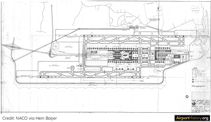 An extremely rare document: the original 1976 Master Plan for the future Changi Airport. The master plan envisaged two parallel runways, which would make Changi only one of a handful of civil airports in the Asia Pacific region to have two runways. The master plan envisaged three passenger terminals, each boasting a capacity of 10 million annual passengers. The plan even had a strategic reservation for a future Terminal 4. With the wisdom of hindsight, we now know that was no luxury! Did you know?
Both the 1976 Master Plan and the design for Terminal 1 were prepared by NACO Netherlands Airport Consultants, the same company that designed Amsterdam's Schiphol Airport.
At the time, Schiphol was a state-of-the-art international transfer hub, receiving the highest praise from passengers and airlines, something the Singaporean government was eager to emulate. 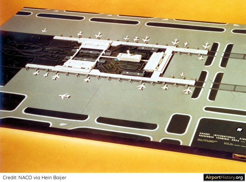 Another unique image: a 1976 model of Changi's future passenger terminal area in its final buildout. The terminal layout shown here was not far off from what ended up being built. A major difference with the model is that in the 1990s, piers were added to Terminal 2, and the piers of Terminal 1 were extended. This was due to transfer traffic being much higher than anticipated, leading to an increased need for aircraft gates. Another difference is that in the model the terminals are connected by means of pedestrian bridges. Instead of this, an Automated People Mover (APM) was built. 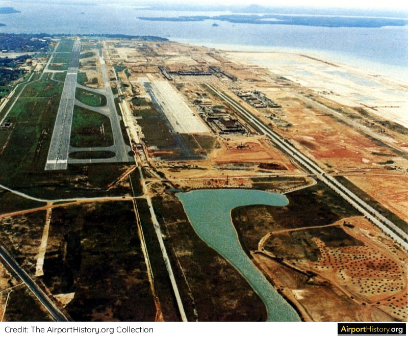 Construction is in full swing in this aerial view, taken in early 1980. Sea-fill and earth fill started in April 1976 and were completed by May 1977. The foundation stone for Terminal 1 was laid in August 1979. At one point, more than 2,500 workers were employed at the site. The total construction cost of Phase 1 was SGD 1.3 billion (USD 964 million)--a hefty sum, let alone 40 years ago! 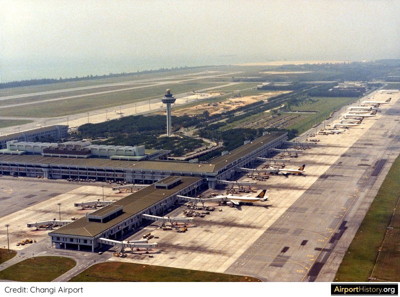 An aerial image of Changi Airport's Terminal 1, ca. 1984. Terminal 1 had an annual capacity of 10 million passengers and featured 22 gates equipped with passenger boarding bridges, a luxury only found at a few airports in Asia at the time. In 1982, its first full year of operation, Changi Airport handled 8.6 million passengers and 217,000 tonnes of cargo. By 2019, this had grown to a whopping 68.3 million passengers and 2.01 million tonnes of cargo. 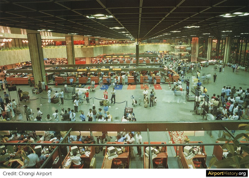 An early 1980s interior view of the check-in hall in Terminal 1. The terminal featured six check-in islands and 120 check-in counters. Terminal 1 had 32 shops and seven food and beverage outlets--a good number for a large, modern airport terminal at the time, but not by today's standards where food and beverage has become the money maker for airports. Today there are 140 F&B outlets serving up various cuisines across all four terminals. Like this article? Support us by donating just $2.95 and receive a fascinating Changi download! 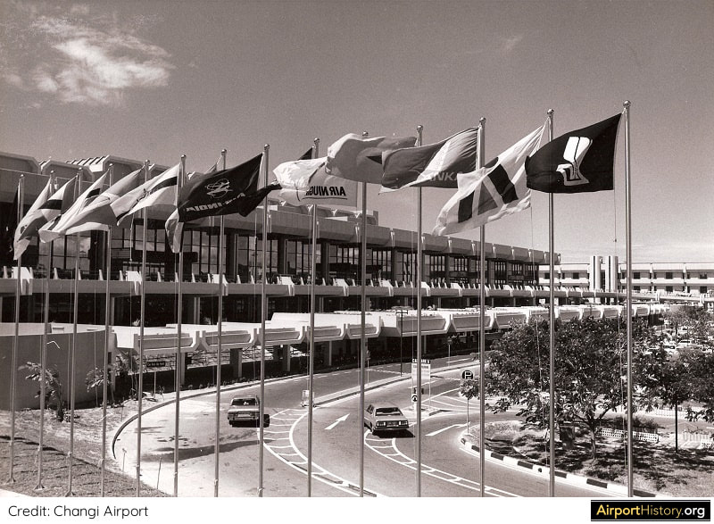 A 1981 exterior view of the newly-built Terminal 1, which at the time cost SGD 250 million (USD 185 million) to build. In 1981, Changi handled 6,888,000 passengers. Did you know?
In its first two weeks of operation, 250,000 visitors – or 10% of the entire population of Singapore back then – visited the airport. 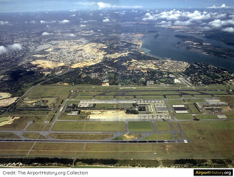 An aerial of Changi Airport, taken ca. 1986, showcasing its orderly, master planned layout. In the middle of the image, earthworks are underway for the construction of Terminal 2. Are you able to spot the remnants of the old RAF Changi? 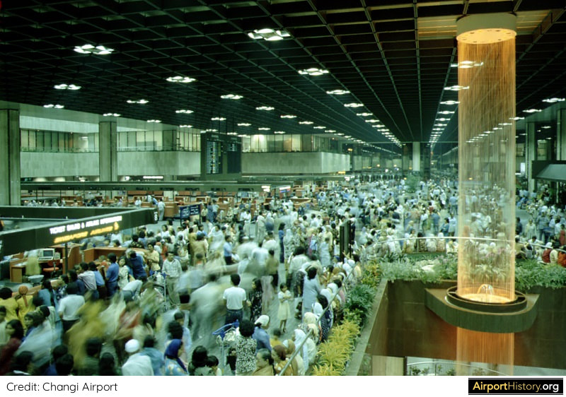 Another view of Terminal 1 during rush hour. To the right we can see the Mylar Cord Waterfall that “rained down” in Terminal 1 for 31 years, until it was replaced in 2012 with the Kinetic Rain installation. 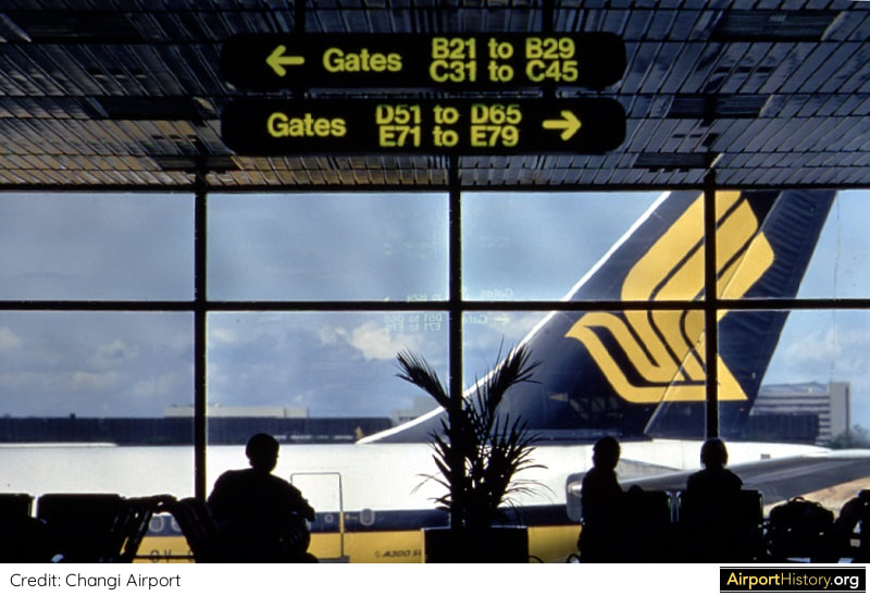 Passengers awaiting their flight at one of the gates. Changi Airport's signage was also inspired by that of Amsterdam's Schiphol Airport--but whereas Schiphol has the yellow bright signs with black letters, this was inverted for Changi. 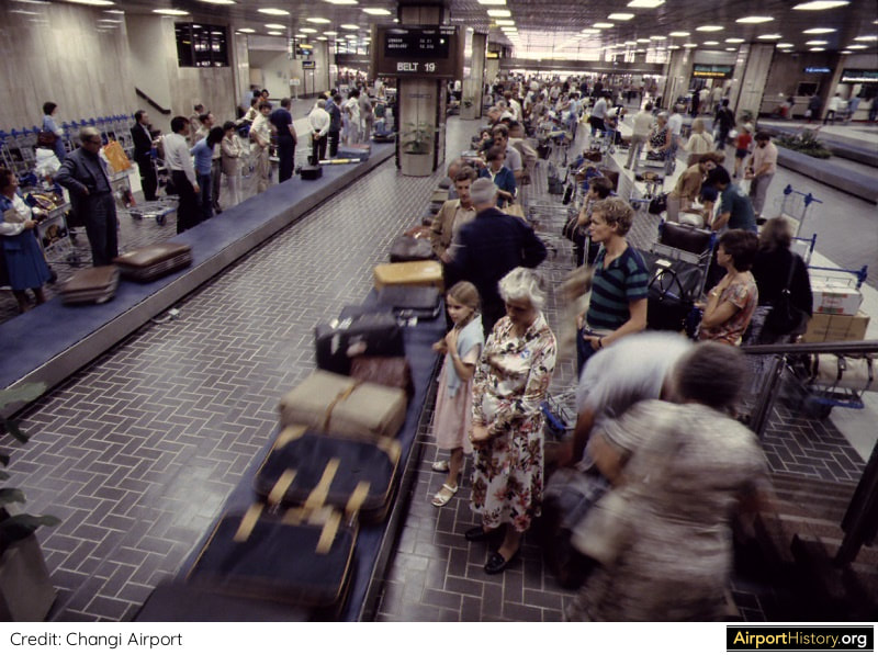 A vintage view of the baggage reclaim area of Terminal 1. 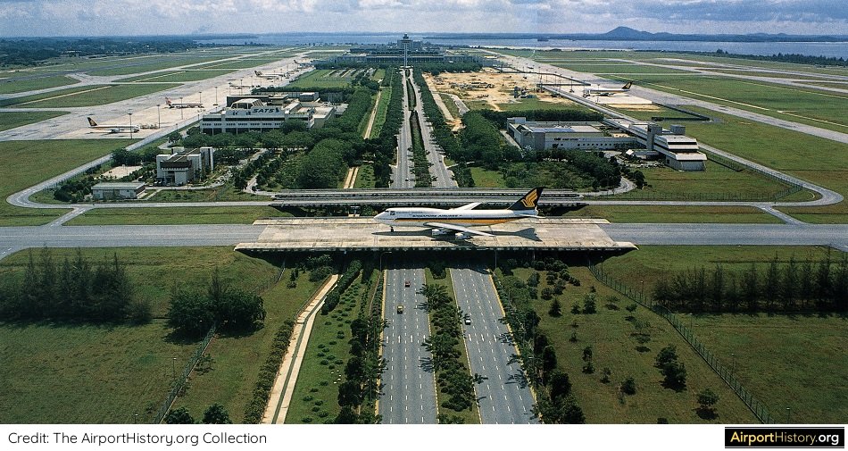 A 1986 view, looking northwest towards Terminal 1. Changi was only the third airport in the Asia Pacific region to feature an aircraft taxiway bridge. Which airports had them first, you ask? You can find out the answer here! BONUS: A fascinating video from the National Archives of Singapore, covering the airport's design, construction and early years of operation. What are your thoughts about Singapore's Changi Airport? Leave your comments below! More airport articles: Click here Want more stunning airport photos & stories?
Sign up to our newsletter below to know when new content goes online! I want to extend a special thanks to Hein Baijer for making available the NACO materials.
On September 21st, it will have been 40 years ago that Atlanta's Midfield Terminal Complex opened for traffic.
Its characteristic layout of long concourses, perpendicular to the runway and connected by an underground people mover system, ensured a highly efficient movement of both passengers and aircraft. For the decades that followed, Atlanta would become the gold standard for the design of hub airports. However, did you know that the design evolved from a plan that was very similar to the original plan for Dallas/Fort Worth Airport? It's only due to project delays that we got the the "ATL" we know today. Read all about it below! 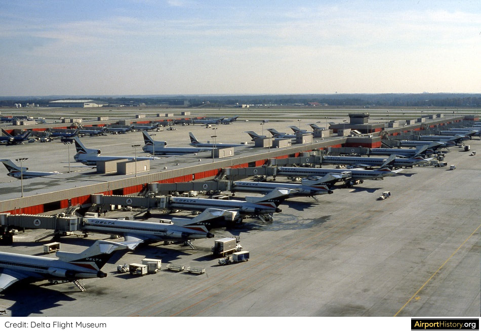
Atlanta Hartsfield-Jackson Airport in 1981, a year after opening of the Midfield Airport.
THE NEED FOR A NEW TERMINAL
Atlanta's previous terminal was completed in 1961. It was originally designed for 13.5 million passengers, a level that was already reached in the mid-1960s. In 1967 the city decided it was time to build a new terminal and modify the existing one. In November 1967 a consortium of architects commenced the difficult task of designing the world's largest air passenger terminal building. Everyone--the airlines, the two participating joint venture planning firms and even airline pilots--submitted ideas for the terminal design. The architects compiled sixty concepts into a briefing book. Those were narrowed down to ten for a more detailed study. INSPIRATION FROM TEXAS In the late 1960s the primary consideration in airport design was passenger convenience in the form of short walking distances between parking facilities and aircraft gates. In December 1967, the master plan for the newly planned Dallas/Fort Worth Regional Airport was published. Prepared by Walther Prokosch, who also designed the original Pan Am terminal and the Worldport expansion, the plan proposed the concept of 20 self-contained terminals along a connecting roadway. 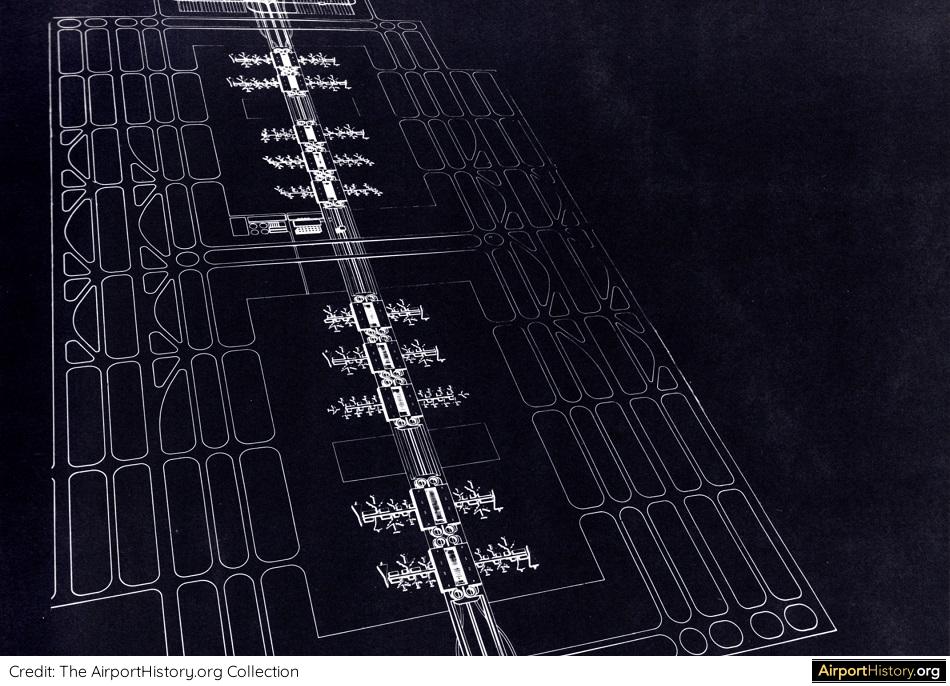
An artist's impression of the original master plan for the new Dallas/Fort Worth Regional Airport. In a way, the plan can be seen as an optimized version of New York Kennedy's Terminal City but also LAX, with each airline operating its own facilities. Later on, the terminals were changed to a semi-circular shape.
Airlines praised the model. They loved the idea of operating their own airport facilities and the small airport convenience the "mini-terminals" brought.
Thus, the Atlanta architects developed their own version of the DFW plan. They conceived the midfield complex as a series of sixteen terminal units along structural, double-decked roadways of Interstate 85 on the west. The roadways met on the east side and continued at ground level to Interstate 75. Each terminal was self-contained with aircraft gates, ticketing and baggage facilities. The 600-foot (183-meter) central strip was dedicated to roadways and parking garages. A people mover system ran through the upper level of each terminal, parallel to the roadways. Other features included a hotel and an automated sorting system for mail and baggage. 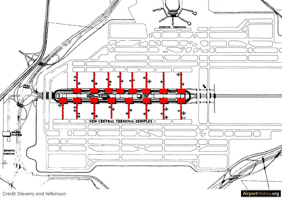
The original 1968 concept for Atlanta's midfield terminal, which boasted 16 terminal units. The concept was more tailored toward local passengers than transferring passengers, who would be hugely inconvenienced.
SLIPPING TIMELINE: A BLESSING IN DISGUISE
Initially the completion date for the new midfield expansion was 1972. However, the timetable slipped by years due to airline politics, economic downturns, financing issues as well as discussions about a second airport. This had a major advantage: there was ample time to adjust and fine-tune the design for the midfield complex. By 1971 the original design was still more or less intact. However, the central area had been reduced from 600 to 200 feet and the people mover was no longer elevated. The layout was very much tailored to Atlanta's "O&D" (origin and destination) passengers. However, at the time 70% of passengers changed flights at the airport. With the proposed design, most transfer passengers would have to change terminals in order to catch their onward flight. Even cities that had large volumes of connecting passengers had never specifically addressed this situation: they had merely adapted standard airport designs. Therefore, no precedent existed from which Atlanta's planners could draw.
A BREAKTHROUGH
In a conceptual breakthrough in 1973, the complex had been split into two distinct sections, airside terminals with aircraft parking gates and landside terminals for ticketing and baggage. Roadways and parking were moved away from the aircraft gates and concentrated around the landside facilities, making the roadway system much simpler, while still creating curb space for hundreds of cars per hour. Although the separation was not considered particularly significant at the time, it marked the point at which the airport veered away from its "drive to the plane" stance and began to deal with the particular requirements of a transfer airport. Originating and terminating passengers would shuttle between the terminals and six airside concourses on a sunken but exposed people mover system, the sole means of transportation within the complex. As ticketing and baggage facilities no longer had to be provided in each airside terminal, more aircraft gates could be added. The elimination of roadways and parking freed additional space. 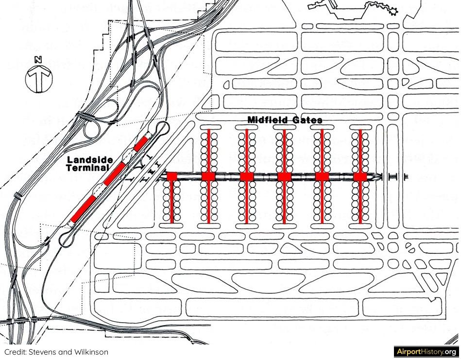
In the 1973 design, the landside and airside facilities were separated. Three landside terminals would be built: one for Delta; one for Eastern; and a smaller third one for the remaining airlines.
LAST BUT NOT LEAST
Another major change was to come in the winter of 1975. Due to an ice storm at Dallas/Fort Worth International Airport, the Airtrans people mover system, the ground level people mover that had been a model for Atlanta's planning, became paralyzed. The designers realized that Atlanta's system would be vulnerable under similar conditions. It was a risk that airlines would not accept. Thus, during an intense brainstorming session Delta's facility department recommended covering the "ditch" that contained the people mover system, thereby protecting it from the elements. Putting the people mover underground also removed the barrier between the north and south runway systems and eliminated the need for costly taxiway bridges. Also, the taxiways that in earlier layouts had separated the landside and airside terminals could be eliminated. Next the Delta team recommended that two parallel terminals replace the three landside linear landside buildings. This move, coupled with the removal of the taxiways, allowed the half-concourse to become a full concourse, adding twelve gates. 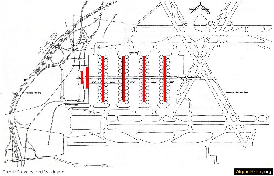
A major breakthrough was to put the people mover in a tunnel, thereby protecting it from the elements, and removing the barrier between the north and south runway system.
THE FINAL STEP IN CREATING THE "ATL" WE KNOW TODAY
A final critical step was to divide the people mover tunnel into two chambers and separate them to allow for a pedestrian mall in between. Lastly, the planners re-positioned the terminals from a north-south to an east-west alignment and placed them back to back. The number of concourses was reduced to four domestic concourses boasting 26 gates each, with space to build a fifth concourse. An international concourse was added adjacent to the north terminal. 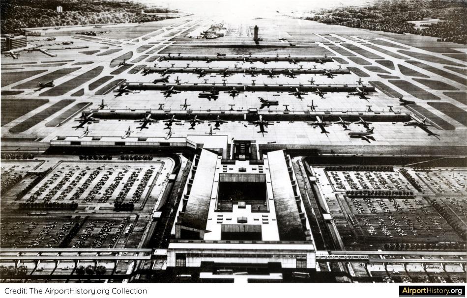
An artist's impression of the final design. The total handling capacity was to be 75 million annual passengers, a volume completely unheard of at the time.
On April 18th, 1977, the contracts for construction of the terminal building and the people mover were awarded and construction could begin, almost ten years after the start of the design process. All good things take time!
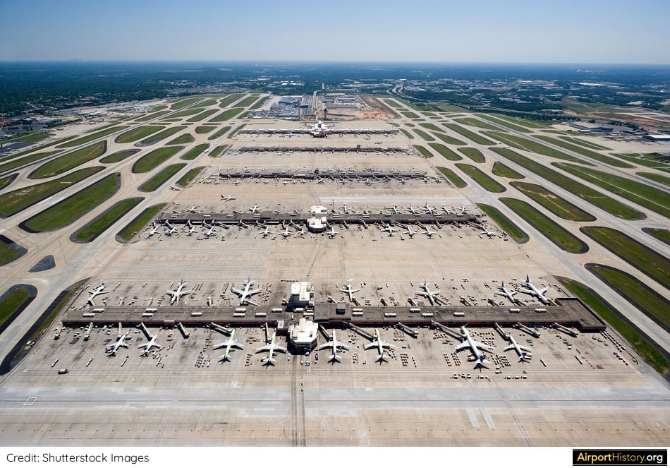
The Midfield Terminal today.
For this blog the fantastic 1989 book "A Dream Takes Flight" by Betsy Braden & Paul Hagan was a huge inspiration. I highly recommend this book to anyone who wants to know more about the history of Atlanta Airport pre-1990.
We hope you enjoyed this little piece of history on the development of Atlanta's Midfield Terminal. In the future we are also planning a full multi-part history on the development of Atlanta Hartsfield-Jackson Airport. Sign up below to know when new content is released!
More airport articles: Click here
Want more stunning airport photos & stories?
Sign up to our newsletter below to know when new content goes online!
ACKNOWLEDGEMENTS
I want to give a special thanks to Marie Force of the Delta Flight Museum for her assistance in preparing this article.
Back in the late 1990s, Frankfurt Airport considered re-configuring its runway system to an Atlanta-style layout with four parallel runways. Read the story behind this plan below!
In the 1990s, Frankfurt Airport wanted to reconfigure the runway system to a layout similar to that of Atlanta Hartsfield-Jackson Airport.
BACK IN TIME: THE NEED FOR A NEW RUNWAY
The idea of building an additional fourth runway for Frankfurt Airport was first proposed in 1997 by Lufthansa's then-CEO Jürgen Weber. The year prior, Frankfurt had handled over 38 million passengers and 386,000 aircraft movements. The runway layout allowed for 80 movements per hour, translating into about 420,000 annual movements. Thus, the capacity ceiling was in sight. With nearby competitors Amsterdam Schiphol and Paris de Gaulle adding new runways and planning to increase their hourly capacity to a 120 aircraft movements, something needed to be done. A proposed new runway would allow the number of hourly takeoffs and landings to grow by 50% to 120 per hour, translating into over 660,000 annual movements and doubling the number of annual passengers to over 72 million by 2015. Frankfurt's last new runway, the north-south runway named "Startbahn West" (West Runway) had opened in 1984 and became the focus of intense protests by environmentalists, which even lasted three years after the runway had opened. 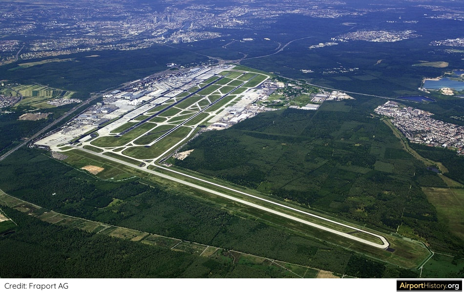
A 1990s aerial view of Frankfurt looking northeast. The West Runway, which opened in 1984, is visible in the foreground.
COMMUNITY INVOLVEMENT
With this experience still in mind, the airport decided to closely involve residents of the surrounding communities in the planning process. A pact was made stipulating that the new runway could only be built if it was supported by the majority of nearby residents. Fourteen different variations for increasing runway capacity were studied. The main options involved building a new runway northwest, northeast or south of the airport. Other options were to optimize the current runway system by using new procedures and technologies or by realigning the runway system. Yet another option saw part of traffic being transferred to nearby Erbenheim Airport, a general aviation airport located 9 miles (15 km) west of Frankfurt Airport. The remaining options were different combinations of the above options. THE ATLANTA MODEL The most ambitious option involved building two new east-west oriented runways south of the existing airport, providing the airport with four parallel runways and allowing both simultaneous parallel takeoffs and landings. Under this option, the north-south runway would be closed. The layout was appropriately named the "Atlanta Model". Depending on the mix of aircraft, this layout would allow up to a 150 aircraft movements an hour, as opposed to 120 with most other expansion options. Unsurprisingly, this was the option backed by the home carrier Lufthansa, which operates a global hub out of Frankfurt. 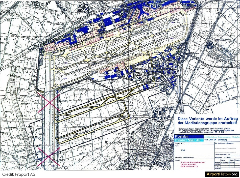
The Atlanta layout involved the construction of two new runways south of the existing airport, one measuring 13,000 feet (4,000 meters), the other 10,000 feet (2,800 meters). The existing north-south runway would be closed.
Although never explicitly stated at the time, the Atlanta Model would also have the additional benefit of enabling the airport to do a bit of "land grab", by creating a huge new midfield area, similar to what Schiphol did with the addition of the infamous Polderbaan.
The midfield area--nowadays largely developed with cargo and maintenance facilities--could eventually have been used to develop a large new passenger terminal complex for Lufthansa and its partner carriers. 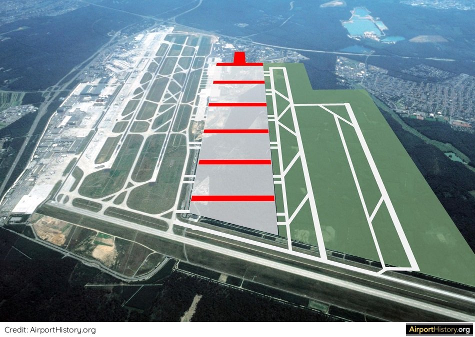
An impression of what the Atlanta model could have looked like. Note the newly created midfield area, which would have offered the opportunity to develop a large-scale midfield passenger terminal complex.
POLITICAL REALITY
The Atlanta Model was not without its issues. Until the majority of traffic would move to a future midfield terminal, taxiing times to/from the existing terminals would be long and aircraft would have to cross the existing parallel runways, raising the risk of runway incursions. Also, part of the then new Cargo-Sud (Cargo-South) complex would have to be torn down. From a community point of view, the problem with the the Atlanta Model was that it would almost double the airport in size and 600 hectares (1500 acres) of city forest would need be to cut. Also, the number of people affected by aircraft noise would increase by almost half a million. This made the Atlanta Model politically unattainable, and thus, it disappeared off the table. A COMPROMISE Three options remained: the construction of a single new runway north-east, north-west or south of the airport. The conclusion was that a runway north-west of the airport site would have the least impact on local residents and the surrounding environment. The runway's location--north-east of the existing airport and squeezed against the autobahn A3--was quite ingenious in that the layout is extremely compact, thereby barely increasing the airport's footprint. Only a relatively small amount of trees would need to be cut down to build the runway. Also, the amount of additional people affected by noise would be limited to about 225,000. 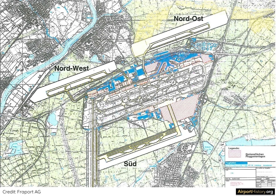
A map showing the three viable options. For the northwest and northeast option, the runway could only be used for landings.
LANDINGS ONLY
As part of the concessions to get the buy-in from local communities, the runway would be used exclusively for landings, and only aircraft types up to the size of an Airbus A340 would be allowed to use the runway. In December 2007, the plans were approved by the Hessian government (Hesse is the state where Frankfurt is situated) and construction on the runway started in early 2009. In October 2012, after 15 years of discussion, planning and construction, Frankfurt opened the fourth runway, providing the airport with a total of three east-west parallel runways and one north-south runway. 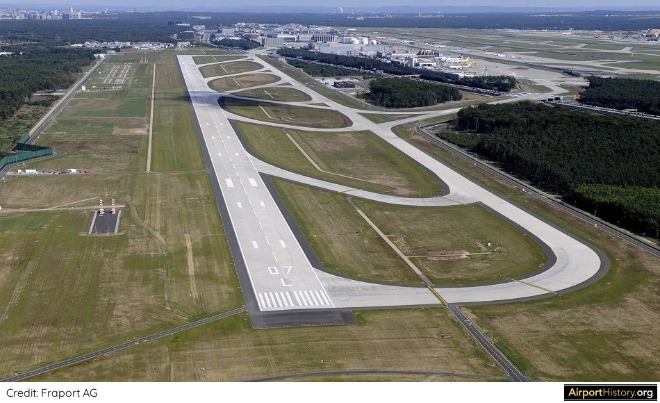
An aerial image of the new runway looking west. At 9,240 feet (2,800 meters), runway 07L/25R is Frankfurt's shortest runway. It can be used for landings only for aircraft up to A340 size. The MD-11, 747 and A380 are not allowed to make use of the runway.
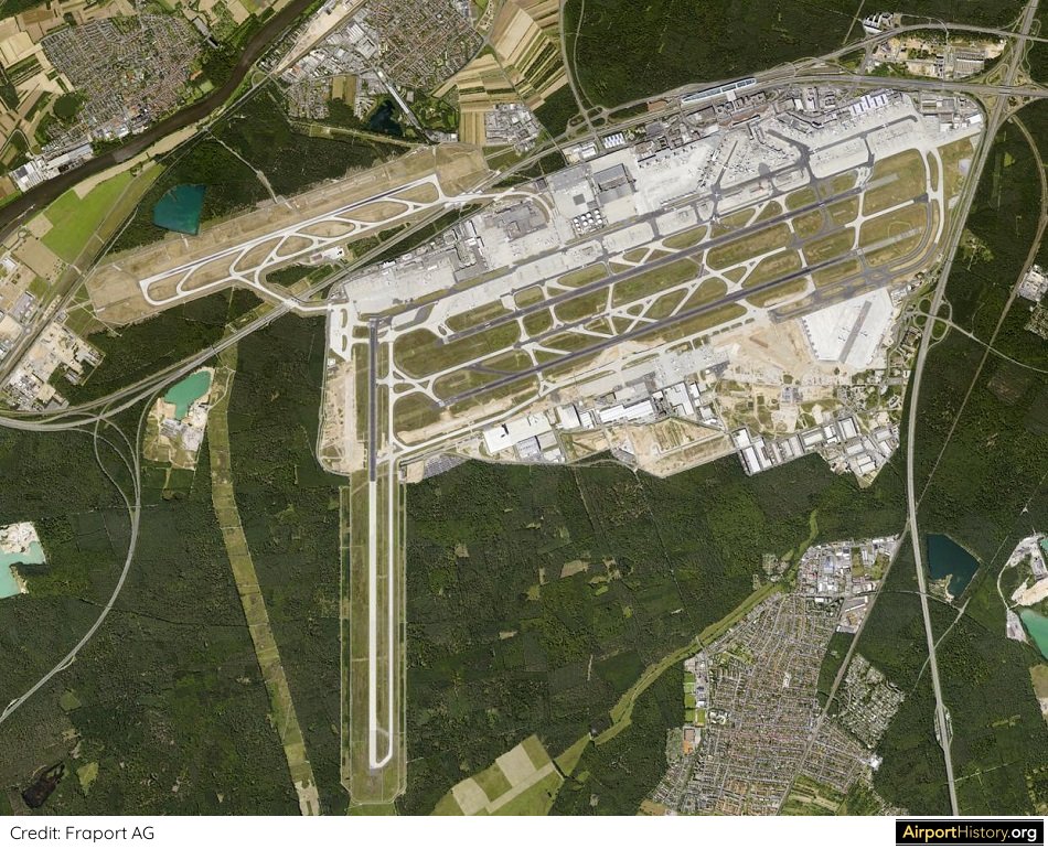
This vertical aerial image clearly demonstrates the very compact layout of the Frankfurt Airport. The fourth runway, located just north of the A3 highway has only moderately increased the airport's footprint.
The things that could have been if they had gone with the "Atlanta Model"! What do you think? Let us know your thoughts in the comments below!
Want more stunning airport photos & stories?
Sign up to our newsletter below to know when new content goes online! ACKNOWLEDGEMENTS I want to give a special thanks to Markus Grossbach and Annette Schmidt of the Fraport Archive for their help in preparing this article.
Everyone who frequently flies in and out of Schiphol will be familiar with the infamous runway 18R/36L.
Opened in 2003, the runway is located a whopping 3 miles (4.5 km) from the terminal area and it can take 20 minutes or more to taxi from the runway to the gate! Some people refer to it as a planning blunder, but is it? In today's post, I will argue that the runway's remote location was actually well considered. 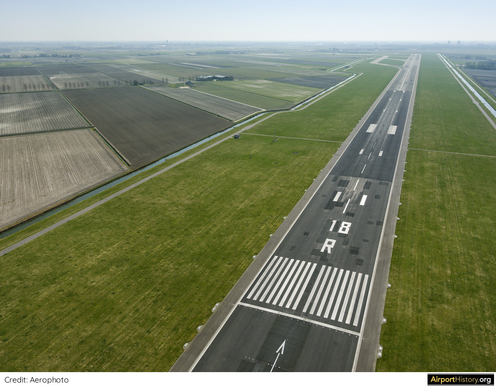
A aerial view of runway 18R/36L looking south. Wait, where is the rest of the airport?!
THE 'ENVIRONMENTAL RUNWAY'?
So, why was the runway so far away from the airport? In the early 1990s, when the project was going through the public consultation phase, the runway was pitched to the public as the "environmental runway". Supposedly, its location was optimized so that departure and arrival routes would avoid overflying built-up areas as much as possible, explaining its eccentric location. However, the runway first appeared in planning documents in 1967, when there was a lot less urban development around the airport and when jet noise was much less of an issue. 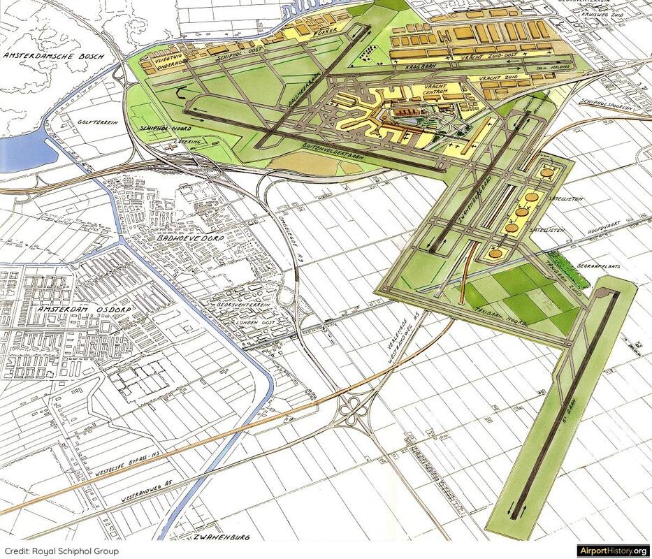
An artist's impression of the "future" runway, which is located in the bottom right of the image. Note the round satellite buildings between the new runway and the neighboring parallel runway. To date, the connecting "noord" (north) taxiway has not been built.
A SECOND TERMINAL COMPLEX?
The real reason was to secure land for future development, lots of land! By building the runway at its current location, a huge tract of empty farmland between the airport and the new runway effectively came under control of the airport, creating the possibility to develop new passenger handling facilities in the far future. Indeed, hidden deep inside the planning documents was a single sentence referring to the development of a "second terminal complex" in the space between the airport and the new remote runway. With that realized, the runway's location would suddenly be quite practical, wouldn't it?
Did you know?
Runway 18R/36L is named "Polderbaan" or "Polder Runway." The word "polder" refers to the typical Dutch phenomenon of dry- pumped lake beds, on which Schiphol is built.
Indeed, hidden deep inside the planning documents was a single sentence referring to the development of a "second terminal complex" in the space between the airport and the new remote runway. With that realized, the runway's location would suddenly be quite practical, wouldn't it?
No concept for this second terminal complex was ever developed. However, artist's impressions of the expanded Schiphol did show a number of satellite buildings, connected to the existing terminal by means of an automated people mover (APM). 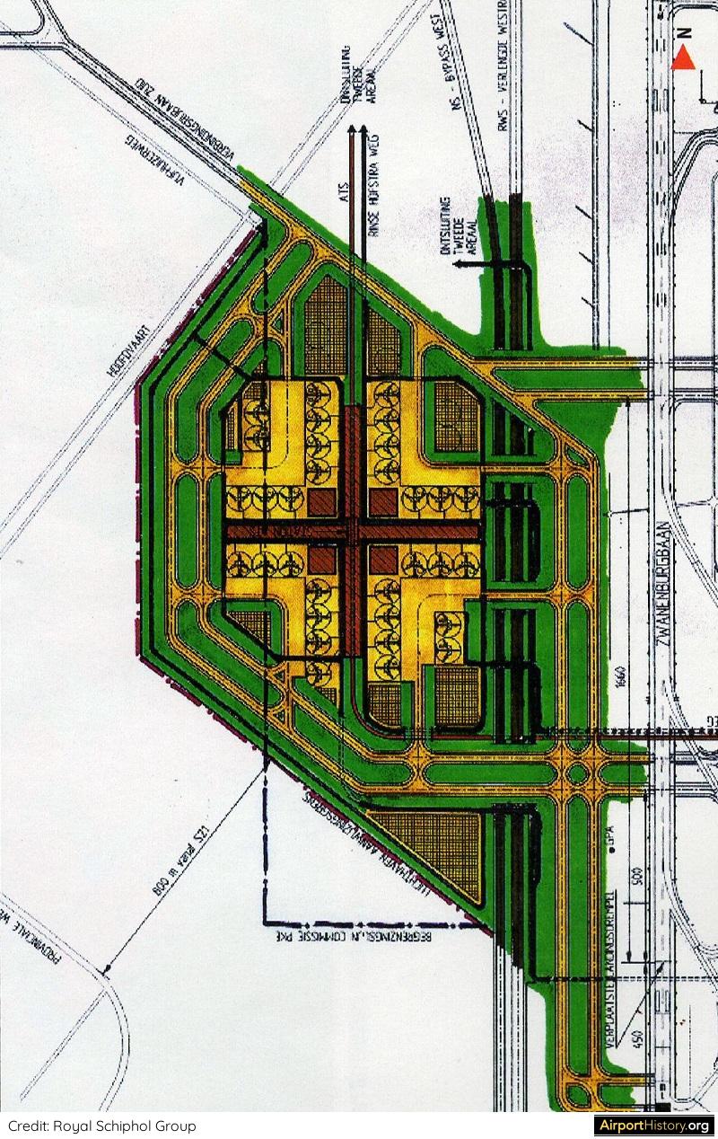
A detailed concept for the area envisaged the construction of a number of cross-shaped satellite buildings.
Want more stunning airport photos & stories?
Sign up to our newsletter below to know when new content goes online.
CHANGE OF PLAN
Over the years the thinking about Schiphol's long-term evolution has changed. More recent plans envisage a second terminal building north of the current terminal complex, rather than northwest. This location would optimize connections to the existing terminal as well as existing road and rail connections. For the huge area in between runways 18R/36L and 18C/36C, planners have come up with the idea to construct yet another runway, which would provide Schiphol with four parallel north-south runways. This would still not preclude the development of satellite buildings at some point in the future. 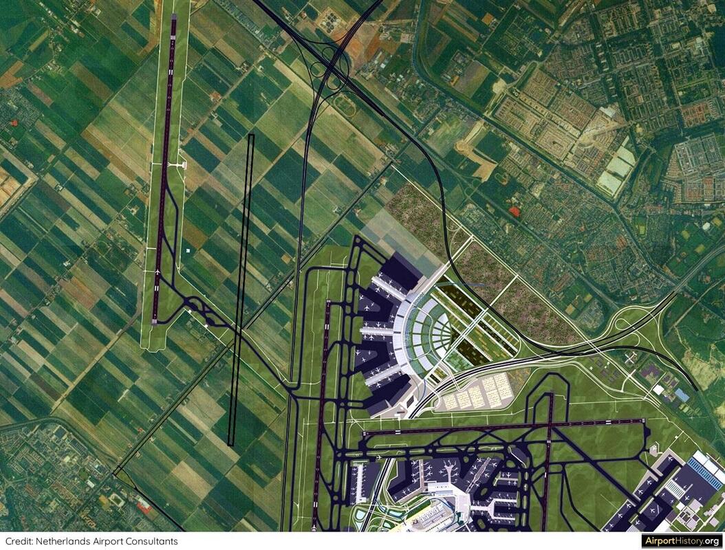
Recent plans envisage the construction of a new passenger terminal north of the current passenger terminal complex. As you can see, a fourth parallel runway has been proposed in between runways 18C/36C and 18R/36L. Not pictured here is a planned seventh runway parallel to runway 06/24.
AN UNCERTAIN FUTURE
Currently, Schiphol can still accommodate growth within the current runway system and terminal area. A new Pier A will open in 2023, raising the capacity with 14 million annual passengers to a total of 78 million annual passengers. An adjoining terminal will be built later on if and when demand bounces back. With almost 500,000 aircraft movements in 2019, growth at Schiphol has hit a political ceiling. Currently, a debate is ongoing on if and how to accommodate growth in the long term. The Dutch government as well as the general public traditionally have taken a pro-growth stance. However, with addressing climate change becoming an ever more urgent priority, the outcome of the discussion is currently uncertain. One thing is certain however; if the government does decide to allow further growth, plans are ready to accommodate it! What are your thoughts on Schiphol's Polderbaan and the airport's long-term development? Let us know in the comments below!
Want more stunning airport photos & stories?
Sign up to our newsletter below to know when new content goes online.
|
With a title inspired by the setting of the iconic 70s film "Airport", this blog is the ultimate destination for airport history fans.
Categories
All
About me
Marnix (Max) Groot Founder of AirportHistory.org. Max is an airport development expert and historian. |
 RSS Feed